Order by phone
12 380 45 18
Cart
VIEW FULL MENU
Home
About
Menu
Contact
Explore Our Menu
Dive into the world of Indian cuisine — colorful, aromatic, and unforgettable.
Delicious Meal
Our Menu
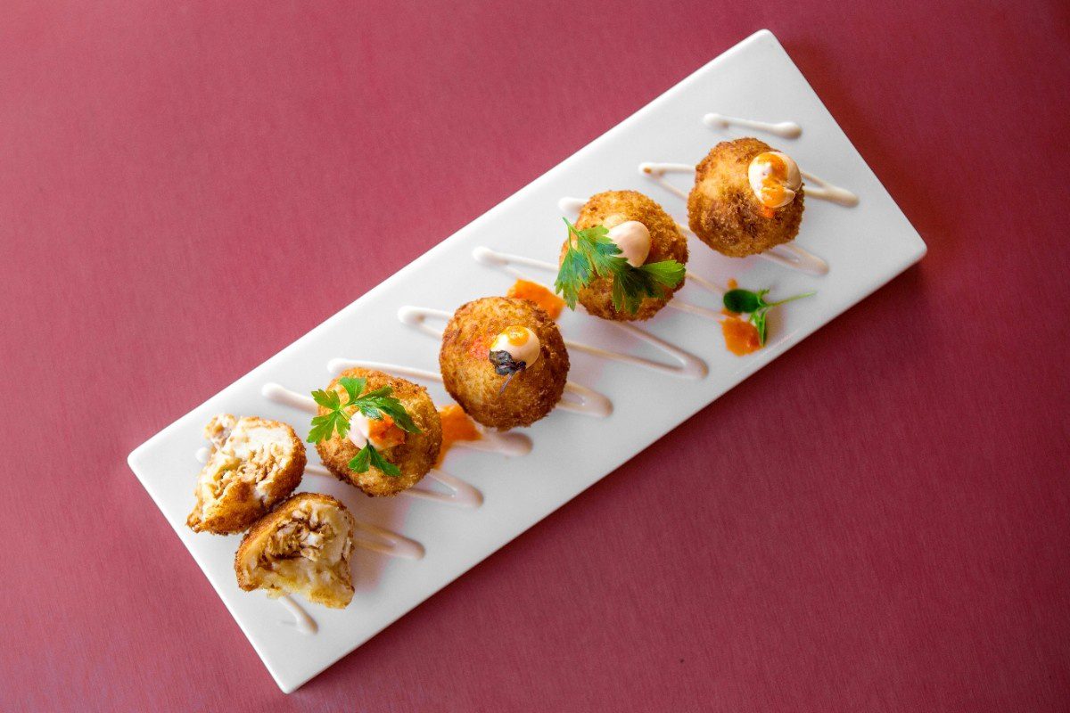
STARTERS
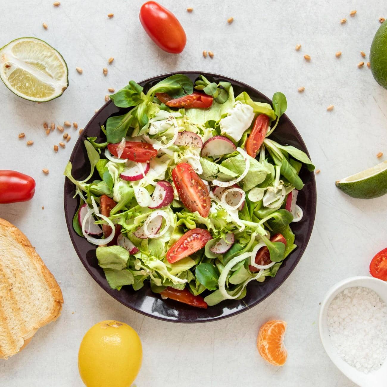
SALADS
220gr / 600 cal
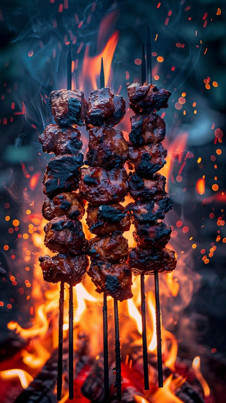
TANDOOR BBQ ITEMS
220gr / 600 cal
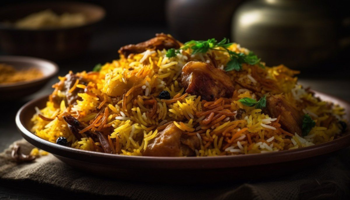
BIRYANI
220gr / 600 cal
RAITA & EXTRA
220gr / 600 cal
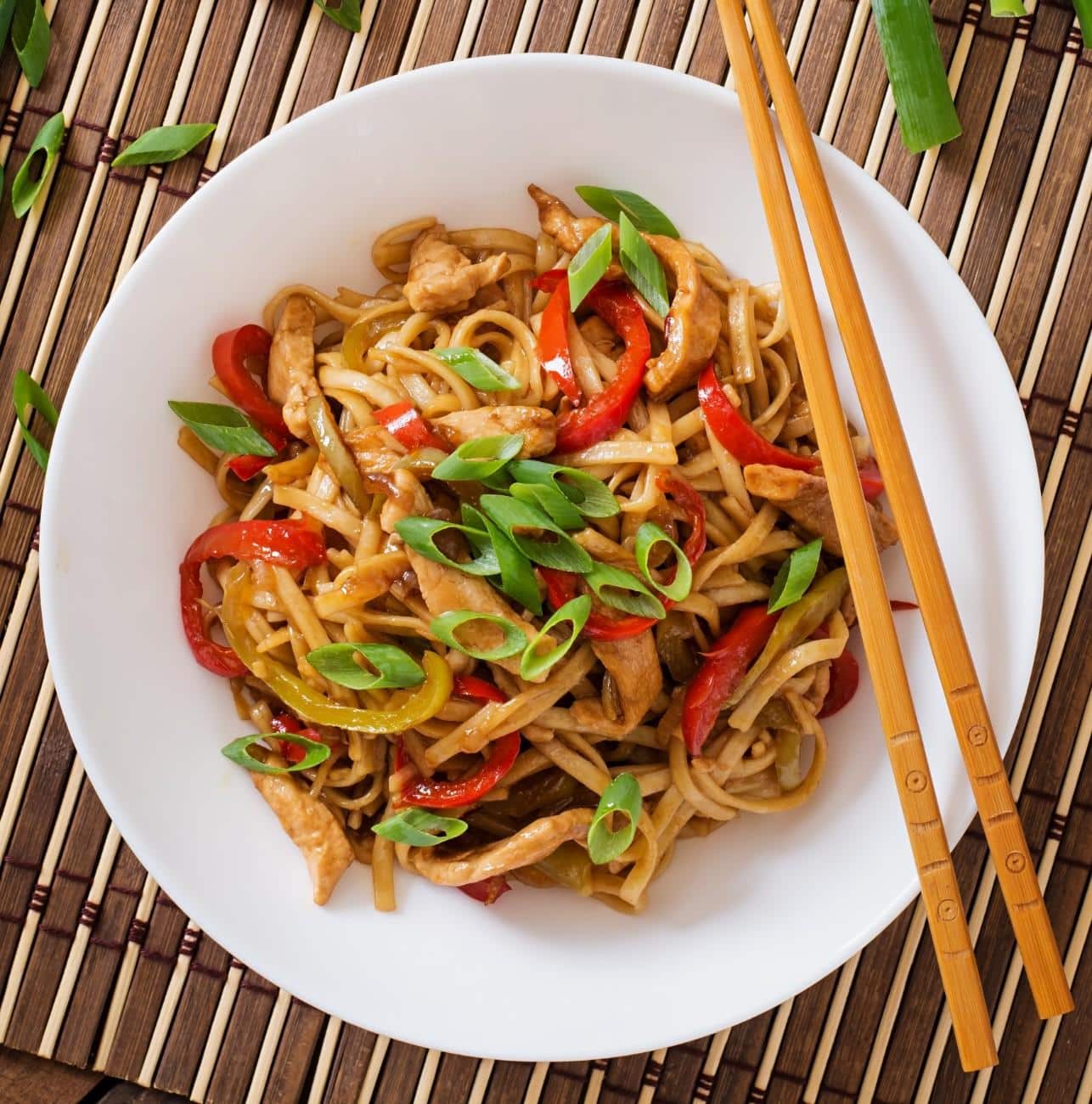
INDIA’S NOODLE SPECIALITY
220gr / 600 cal
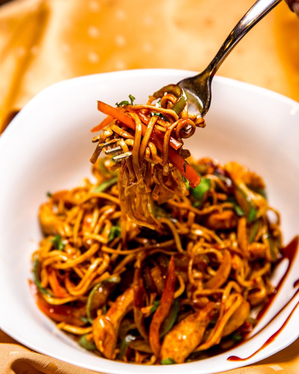
INDO-CHINESE FUSION
220gr / 600 cal
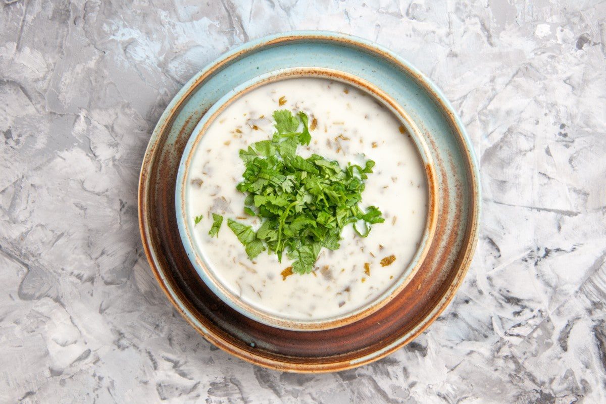
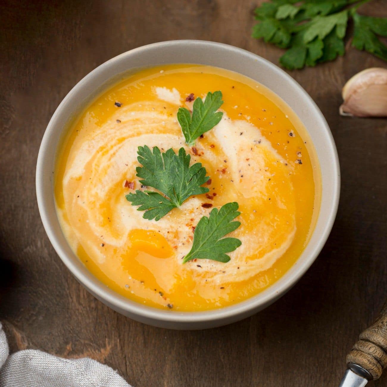
SOUPS
220gr / 600 cal
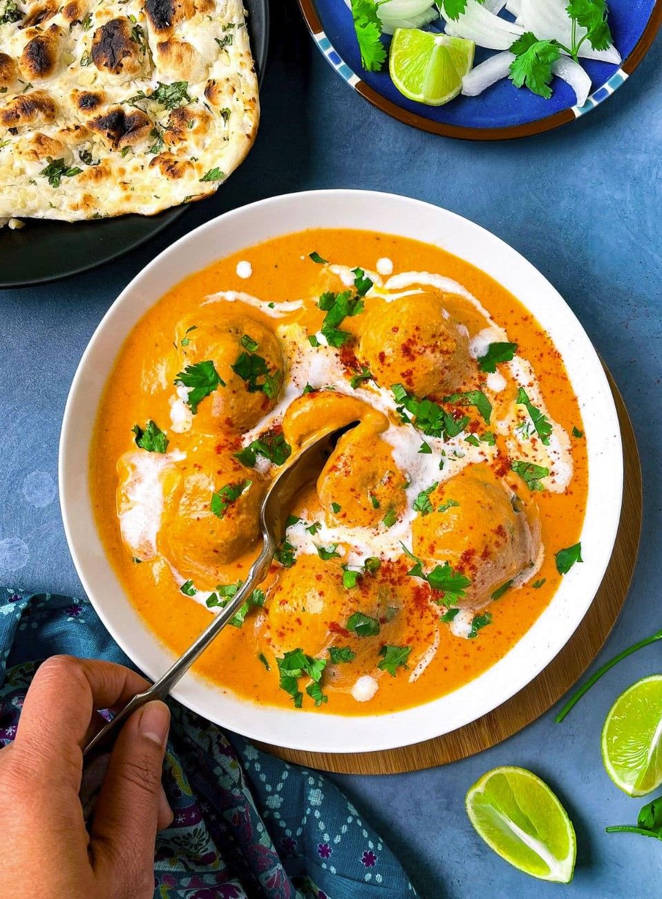
KOFTA ITEMS
220gr / 600 cal
PALAK SAUCE
220gr / 600 cal
SANGAMINDIA SPECIAL
220gr / 600 cal
KEEMA SAUCE
220gr / 600 cal
220gr / 600 cal
220gr / 600 cal
220gr / 600 cal
/* =========================== Scoped square responsive menu images (centered on mobile) - Scoped to #My-custom-menu-section only - Fixes portrait-image gaps - Keeps hover zoom - Shows two cards per row on mobile and centers them =========================== */ #My-custom-menu-section .bt_bb_single_product, #My-custom-menu-section .bt_bb_single_product * { box-sizing: border-box; } /* Use aspect-ratio where available (modern browsers) */ @supports (aspect-ratio: 1 / 1) { #My-custom-menu-section .bt_bb_single_product_image { aspect-ratio: 1 / 1; width: 100%; overflow: hidden; position: relative; display: block; border-radius: 18px; background-color: #e9e9e9; } } /* Fallback for browsers that don't support aspect-ratio */ @supports not (aspect-ratio: 1 / 1) { #My-custom-menu-section .bt_bb_single_product_image { position: relative; width: 100%; overflow: hidden; border-radius: 18px; background-color: #e9e9e9; } #My-custom-menu-section .bt_bb_single_product_image::before { content: ""; display: block; width: 100%; padding-top: 100%; /* 1:1 ratio */ } } /* Image fill & cropping — core fix: absolute positioning + min-width/min-height ensure tall or narrow images never leave gaps */ #My-custom-menu-section .bt_bb_single_product_image img { position: absolute; inset: 0; width: 100%; height: 100%; min-width: 100%; min-height: 100%; object-fit: cover; object-position: 50% 50%; display: block; transition: transform 380ms cubic-bezier(.2,.8,.2,1), opacity 220ms ease; transform-origin: center center; backface-visibility: hidden; } /* Links and anchors must also occupy full container */ #My-custom-menu-section .bt_bb_single_product_image a, #My-custom-menu-section .bt_bb_single_product_image a img { display: block; width: 100%; height: 100%; } /* Subtle overlay for text readability */ #My-custom-menu-section .bt_bb_single_product_image::after { content: ""; position: absolute; inset: 0; pointer-events: none; background: linear-gradient(180deg, rgba(0,0,0,0.06) 0%, rgba(0,0,0,0.20) 60%, rgba(0,0,0,0.34) 100%); border-radius: inherit; transition: background 220ms ease; } /* Title container on top */ #My-custom-menu-section .bt_bb_single_product_content { position: absolute; inset: 0; display: flex; align-items: flex-start; justify-content: flex-start; padding: 18px; pointer-events: none; } #My-custom-menu-section .bt_bb_single_product_title .bt_bb_headline_tag, #My-custom-menu-section .bt_bb_single_product_title .bt_bb_headline_tag a { color: #fff !important; text-shadow: 0 4px 10px rgba(0,0,0,0.45); font-weight: 700; pointer-events: auto; } /* Hide price/button area */ #My-custom-menu-section .bt_bb_single_product_price_button { display: none; } /* Card container tweaks */ #My-custom-menu-section .bt_bb_single_product { margin-bottom: 18px; border-radius: 18px; position: relative; overflow: visible; } /* Hover zoom effect on desktop */ @media (hover: hover) and (pointer: fine) { #My-custom-menu-section .bt_bb_single_product:hover .bt_bb_single_product_image img { transform: scale(1.06); } #My-custom-menu-section .bt_bb_single_product:hover .bt_bb_single_product_image::after { background: linear-gradient(180deg, rgba(0,0,0,0.08) 0%, rgba(0,0,0,0.18) 60%, rgba(0,0,0,0.32) 100%); } } /* =========================== Responsive, centered grid behavior (SCOPED) - Desktop: theme handles columns - Mobile: flex-based two-per-row, centered layout =========================== */ /* Scoped boxed rows */ #My-custom-menu-section .bt_bb_row.bt_bb_row_width_boxed_1200, #My-custom-menu-section .bt_bb_row.bt_bb_row_width_boxed { max-width: 1200px; margin-left: auto; margin-right: auto; padding-left: 18px; padding-right: 18px; } /* Desktop */ @media (min-width: 1200px) { #My-custom-menu-section .bt_bb_single_product_title .bt_bb_headline_tag { font-size: 1.4rem; } #My-custom-menu-section .bt_bb_single_product_image { border-radius: 18px; } } /* Large tablet / small desktop (992–1199px) */ @media (max-width: 1199px) and (min-width: 992px) { #My-custom-menu-section .bt_bb_single_product_title .bt_bb_headline_tag { font-size: 1.25rem; } #My-custom-menu-section .bt_bb_single_product_image { border-radius: 14px; } } /* Tablet (768–991px) */ @media (max-width: 991px) and (min-width: 768px) { #My-custom-menu-section .bt_bb_single_product_title .bt_bb_headline_tag { font-size: 1.12rem; } #My-custom-menu-section .bt_bb_single_product_image { border-radius: 12px; } #My-custom-menu-section .bt_bb_row .bt_bb_column { padding: 10px; } } /* MOBILE: center two cards per row using flex on the row holder */ @media (max-width: 767px) { /* Make the row holder a centered, wrapping flex container */ #My-custom-menu-section .bt_bb_row_holder { display: flex; flex-wrap: wrap; justify-content: center; /* centers children */ gap: 12px; /* spacing between columns */ margin-left: 0; margin-right: 0; } /* Default columns inside the section become 50% wide (two per row) */ #My-custom-menu-section .bt_bb_column { flex: 0 0 calc(50% - 12px); /* subtract gap to avoid overflow */ max-width: calc(50% - 12px); box-sizing: border-box; padding-left: 8px; padding-right: 8px; display: block; } /* Keep explicit full-width rows (headers/intro rows) full width. This handles columns that are col-xxl-12 / col-xl-12 inside the section. */ #My-custom-menu-section .bt_bb_row > .bt_bb_column.col-xxl-12, #My-custom-menu-section .bt_bb_row > .bt_bb_column.col-xl-12, #My-custom-menu-section .bt_bb_row > .bt_bb_column.col-xs-12, #My-custom-menu-section .bt_bb_row > .bt_bb_column.col-sm-12, #My-custom-menu-section .bt_bb_row > .bt_bb_column.col-md-12, #My-custom-menu-section .bt_bb_row > .bt_bb_column.col-lg-12 { flex: 0 0 100% !important; max-width: 100% !important; display: block !important; width: 100% !important; } /* spacing and visual tweaks */ #My-custom-menu-section .bt_bb_single_product { margin-bottom: 12px; } #My-custom-menu-section .bt_bb_single_product_image { border-radius: 12px; } #My-custom-menu-section .bt_bb_single_product_title .bt_bb_headline_tag { font-size: 1.02rem; } #My-custom-menu-section .bt_bb_single_product_content { padding: 10px; align-items: flex-end; } } /* Very small phones: slightly reduce paddings */ @media (max-width: 420px) { #My-custom-menu-section .bt_bb_row_holder { gap: 8px; } #My-custom-menu-section .bt_bb_column { padding-left: 6px; padding-right: 6px; } #My-custom-menu-section .bt_bb_single_product_title .bt_bb_headline_tag { font-size: 0.96rem; } #My-custom-menu-section .bt_bb_single_product_image { border-radius: 10px; } } /* Accessibility: focus outline for keyboard users (scoped) */ #My-custom-menu-section .bt_bb_single_product_image a:focus { outline: 3px solid rgba(255,255,255,0.9); outline-offset: 4px; border-radius: 12px; }
EXPLORE ALL